Reimagining how contractors get the job done
Creating a cohesive experience for a commercial roofing manufacturer, from ethnographic research through high-fidelity design.
RESULTS
70+
45+
Improvement opportunities identified via user research
Hours spent shadowing and interviewing end users
Background
A commercial roofing product manufacturer was watching competitors pull ahead on digital experience while their contractors were still dealing with clunky tools, fragmented job information, and processes that hadn't changed much in years. To close the gap, they set out to reimagine three core digital touchpoints: a mobile app for contractors to manage jobs from anywhere, a desktop portal for project managers and office staff handling more complex work, and an overhaul of the tablet app their field inspectors used to conduct roof inspections before issuing warranties.
I had actually helped win this work during the RFP process, building a functional AI-powered prototype in six weeks to demonstrate what the future could look like. When the engagement kicked off, I transitioned from pursuit to delivery, owning the experience strategy and research from day one through final handoff. You can read more about the pursuit here.
Role
Lead Experience Strategist and Researcher
Service Design, Qualitative User Research, Experience Strategy
Timeframe
November 2025 - March 2026
Industry
Construction / Manufacturing
Deliverables
Ethnographic Research, Current State Analysis, Future State Visioning, Product Strategy, Service Blueprint, Usability Testing, Wireframing, High Fidelity Figma Prototypes
Getting close to the user, literally
The first thing we wanted to do was get our team out of the conference room and onto job sites. We knew from the RFP that contractors were the primary persona, but knowing someone is a roofer and understanding what their day actually feels like are two different things. A team of five spent two days shadowing inspectors in the field, following them up onto roofs to see firsthand where the friction lived.
Two things stood out immediately: connectivity and the physical conditions on a roof. Even on busy urban job sites, reliable cell service wasn't guaranteed. Any mobile or tablet experience we designed had to work offline, full stop.
The second was something nobody had put in writing anywhere: white flat roofs are blinding. The glare is intense enough that inspectors had developed their own workaround, tilting their iPads between landscape and portrait mode to cut the reflection and find an angle they could actually see.
We ran a current state workshop with client leadership and sales reps to pressure-test what we were hearing in the field against how the business understood its own processes. We walked through research insights together, did breakouts to map the biggest pain points, and used that as the foundation for a future state visioning session where we could start to imagine what better looked like.
What the initial research told us
Between the shadowing sessions, the current state workshop, and interviews with contractors and internal users across multiple rounds of the project, a few themes kept surfacing.
Job information was scattered and manually re-entered across multiple systems. The data existed somewhere, it just wasn't where anyone needed it when they needed it.
Contractors wanted more independence, but the business had real reasons for guardrails. Products varied by region, local fire marshal codes, and hail ratings, and a mistake in product selection could mean a warranty claim down the line. One sales rep captured the tension well: "We want to help contractors, but there are so many variables that it's risky to let them do it all themselves." The design challenge wasn't just UX, it was figuring out how to give contractors enough autonomy to move fast while keeping the right checks in place.
Comments and collaboration were happening through phone calls and emails because the tools didn't support them. Contractors just wanted a paper trail in the app so they didn't have to remember a conversation from three weeks ago.
FROM A CONTRACTOR
"I want to know immediately what the attachment method is, so I can price confidently and not have to redo estimates." The data existed somewhere, it just wasn't where anyone needed it when they needed it.”
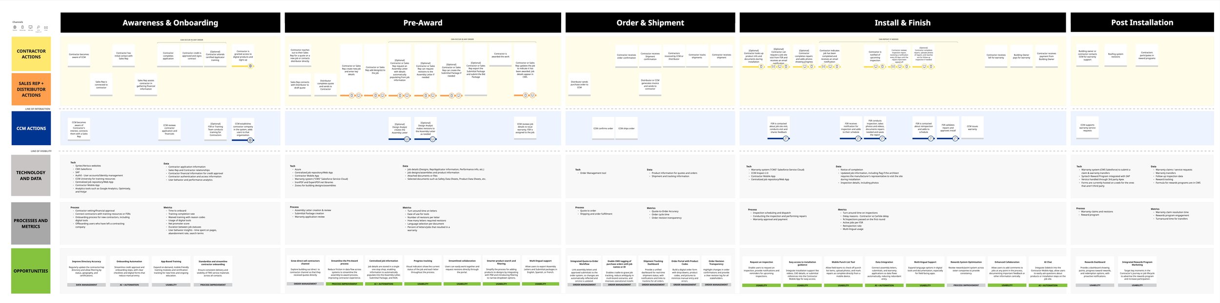
Shaping the future state
With a solid picture of where things stood, I translated the research into a future state service blueprint that mapped the ideal contractor journey end-to-end, across every touchpoint and every team involved in delivering it. This became the connective tissue for the whole engagement, making sure that design decisions on the mobile app didn't create problems downstream in the desktop portal or the inspection flow.
The blueprint surfaced a number of issues that looked like UX problems on the surface but were actually business process problems underneath. Data that should have flowed automatically between systems was being manually re-keyed. Steps that required internal review were creating delays contractors couldn't see or plan around. Addressing those upstream issues was just as important as getting the screen designs right.
From the blueprint, I worked with the team to translate the future vision into wireframes for the MVP, prioritizing the contractor mobile app as the highest-impact place to start.
Designing and testing
When the timeline got tight and development needed something to work from, I flexed into Figma to support high-fidelity design creation for the mobile app alongside the design team. Once the designs were far enough along, I handed that work off and shifted back to leading research and strategy, which is where I could add the most value.
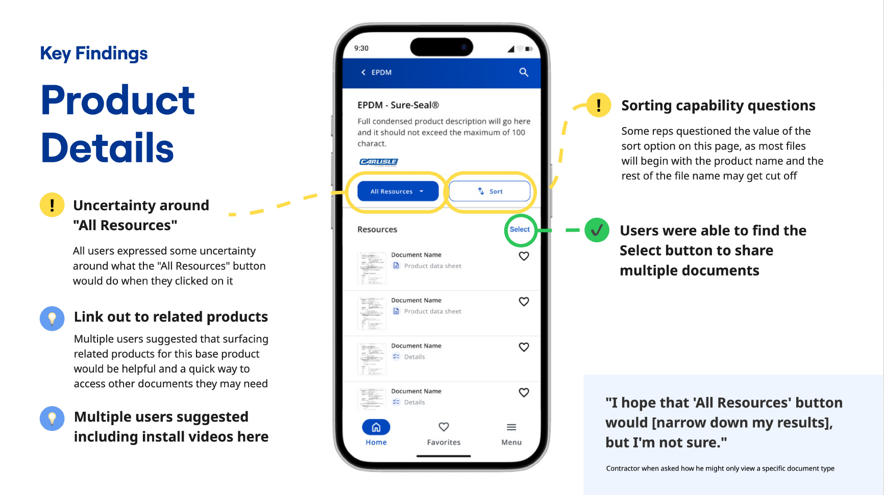
We ran two rounds of usability testing. The first was with 16 contractors on the mobile app, where we surfaced some real friction points around brand selection. This client operated multiple brands under one parent company, each with its own loyal contractor base. When an unauthenticated user opened the app for the first time, they were immediately confronted with a choice between brands they thought of as competitors. It was a bit like opening an app and being asked to choose between Coke and Pepsi before you'd done anything. We worked through several approaches to thread that needle in a way that felt natural rather than forced.
The second round was 20 interviews focused on the desktop portal, with a mix of contractors, sales reps, and internal employees. This research reinforced the blueprint findings: several pain points users attributed to the interface were actually symptoms of process gaps, not design gaps. Surfacing that distinction clearly was important for making sure the right problems got fixed in the right places.

Conclusion
This one was different from a lot of projects I've worked on, because I was there from the very beginning. I helped estimate and plan the engagement during the pursuit, shaped the research approach, facilitated the workshops, led the usability testing, and contributed directly to the designs. Seeing a product vision I had a hand in selling actually come to life, and watching it get pressure-tested against real users, is the kind of end-to-end experience that makes the work stick.
FEEDBACK I RECEIVED
“Kirsten played a pivotal role in pioneering the foundation of the project, leading the UX research efforts that set the entire team up for success. From running workshops, user interviews, and user testing sessions to producing key deliverables like readouts, blueprints, and wire flows, her contributions were thorough, thoughtful, and impactful.”