Redesigning a B2B eComm Experience from the Ground Up
A disjointed checkout experience was costing a B2B eCommerce platform customers and revenue. I led the research and redesign that fixed it and built the design system that kept it consistent long after launch.
RESULTS
95k
86%
Monthly users on the eComm platform
Of customers surveyed found the redesigned out-of-stock features helpful
Background
This was the revenue engine for a B2B storefront where small, independently owned pharmacies bought the generics and over-the-counter products they couldn't get anywhere else. The catch was that the team had been shipping features one sprint at a time without anyone stepping back to see how it all fit together, so the experience had drifted into something disjointed that wasn't really serving anyone.
The customers made the stakes clear. These were hunters, not shoppers. They were busy, price driven, and operating on a cycle that could turn around in as little as 13 hours, from a request coming in to an order going out the door. The eCommerce playbook of leisurely browsing didn't apply. Every extra click was a tax on someone who didn't have time to spare.
On top of all that, the company announced a full rebrand partway through, which meant the design system we'd been leaning on was suddenly off the table, and we were moving from Sketch to Figma at the same time.
Role
Product Designer and Researcher
Product Design, User Research, Design Systems, Prototyping
Timeframe
1.5 years
Industry
B2B eCommerce
Deliverables
User research, Journey maps, design system, high fidelity prototypes
RESEARCH
Understanding the problem
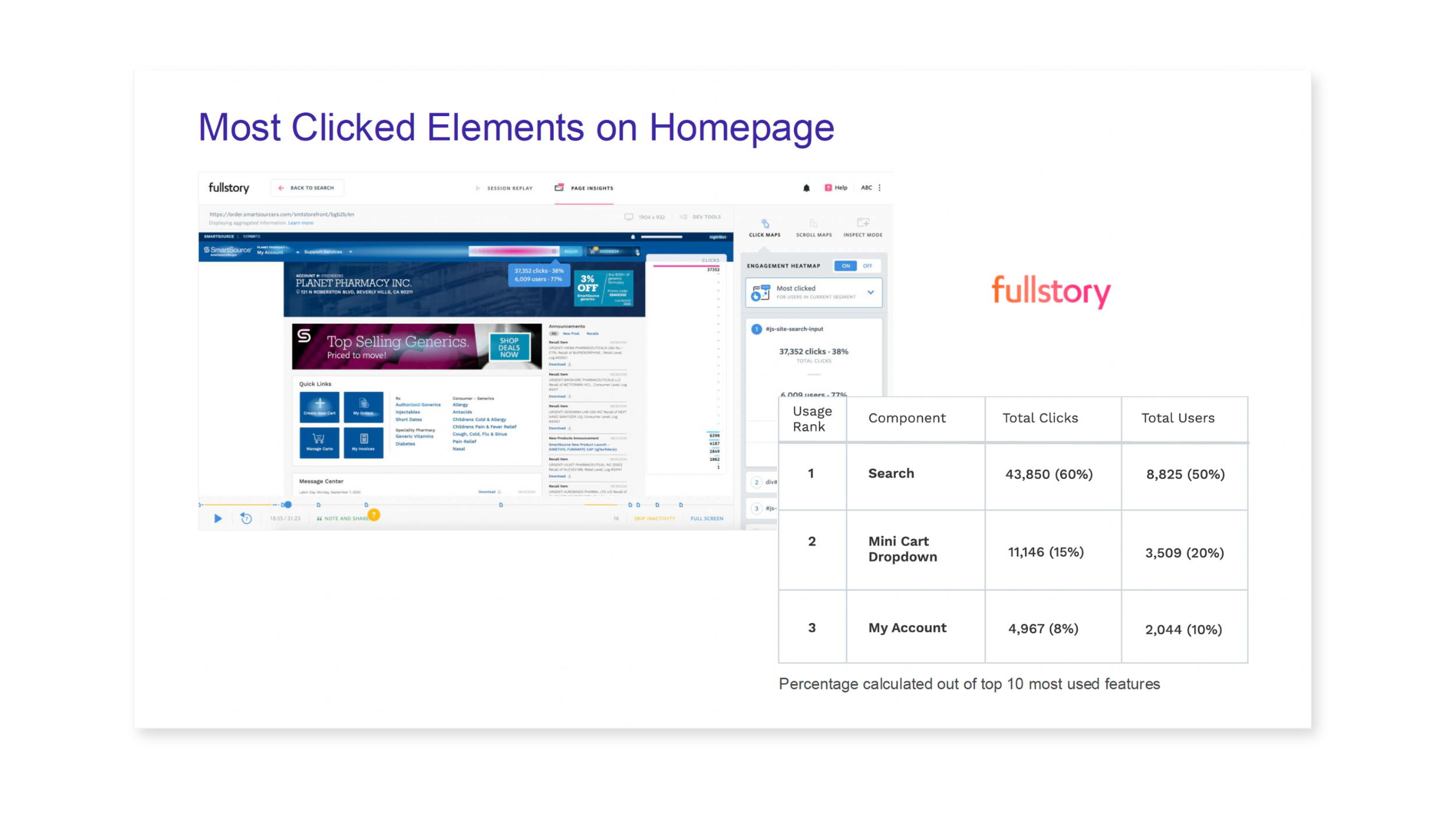
My first step was to get grounded in what customers were actually doing. I leaned on behavioral data from FullStory and Google Analytics to see where people were spending their clicks, and the picture was telling. Search dominated everything, pulling 50% of clicks across the top features. A lot of the quick links we were giving real estate to barely got touched. There was even a dead click on the username in the top bar, where people kept tapping expecting something to happen and nothing did.
I paired that data with direct customer research. One thing I'm proud of from this project is that we pushed to cut our usability testing lead time from a couple of months down to about two weeks, and I advocated for compensating the customers who gave us their time. Faster testing meant we could actually iterate instead of guessing.
That research pointed to a clear set of opportunities: get rid of the unused quick links and move the frequently used ones next to search, turn that dead username click into a real link, surface the promotions and announcements people actually cared about, and add utility-focused features like reorder, recent invoices, back-in-stock, and top purchases right where busy customers could grab them.
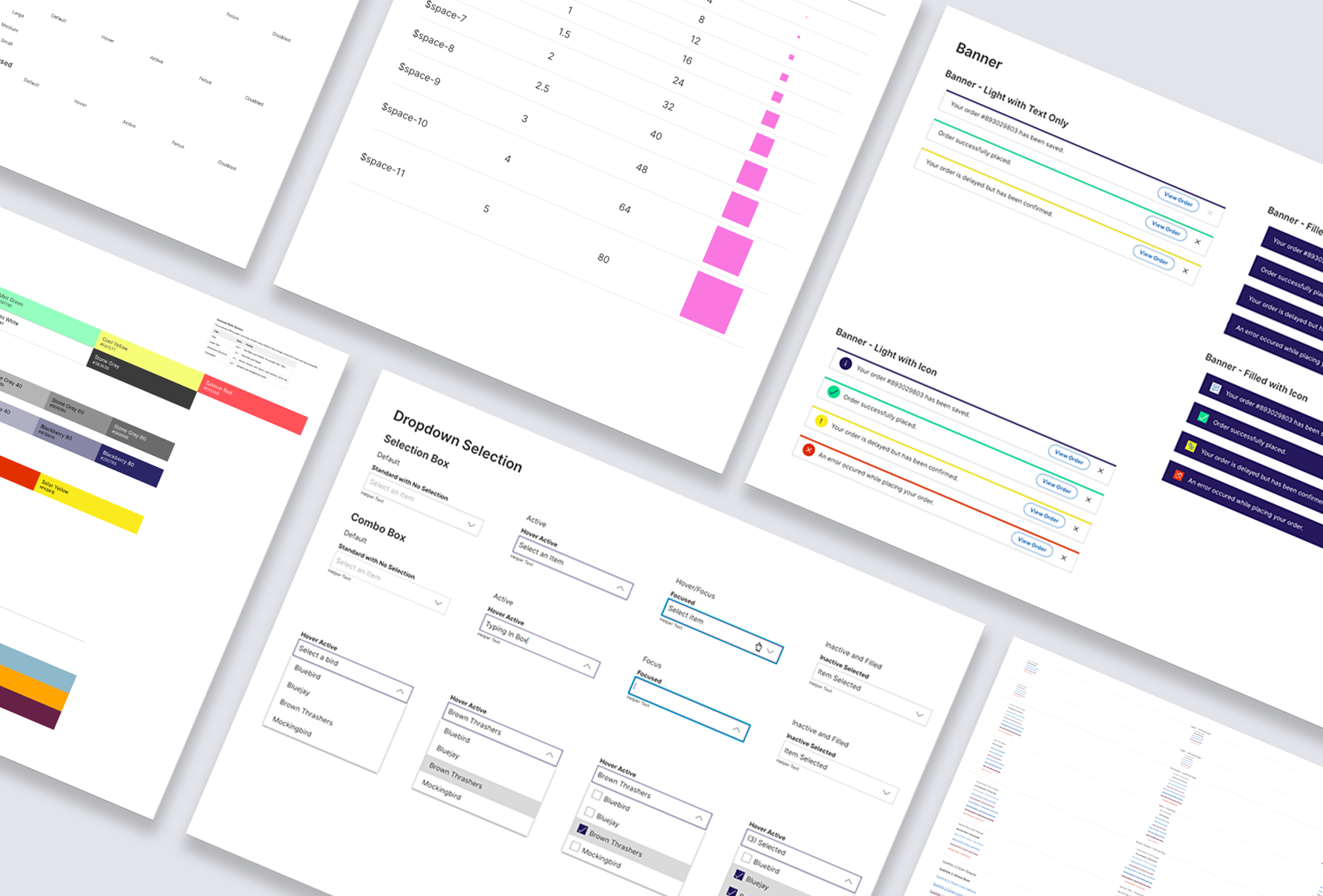
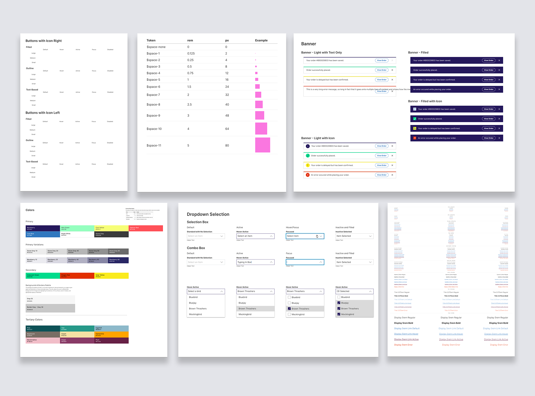
DESIGN SYSTEM
Laying the Groundwork
Before we could build the new experience, we had a foundational problem. The new brand identity was vibrant and energetic, but it didn't meet web accessibility standards out of the box. I worked closely with the brand team to land on a color direction that kept the energy of the rebrand while still passing accessibility requirements, which took some back and forth but got us to a place everyone could live with.
From there I built a design system in Sketch that any designer or developer on the team could pull from. It standardized the new brand across the platform and meant we weren't rebuilding the same button or dropdown every time someone needed one. When the team later moved to Figma, I rebuilt the design system there too, using updated best practices.
DESIGN
Designing for the way customers actually shop
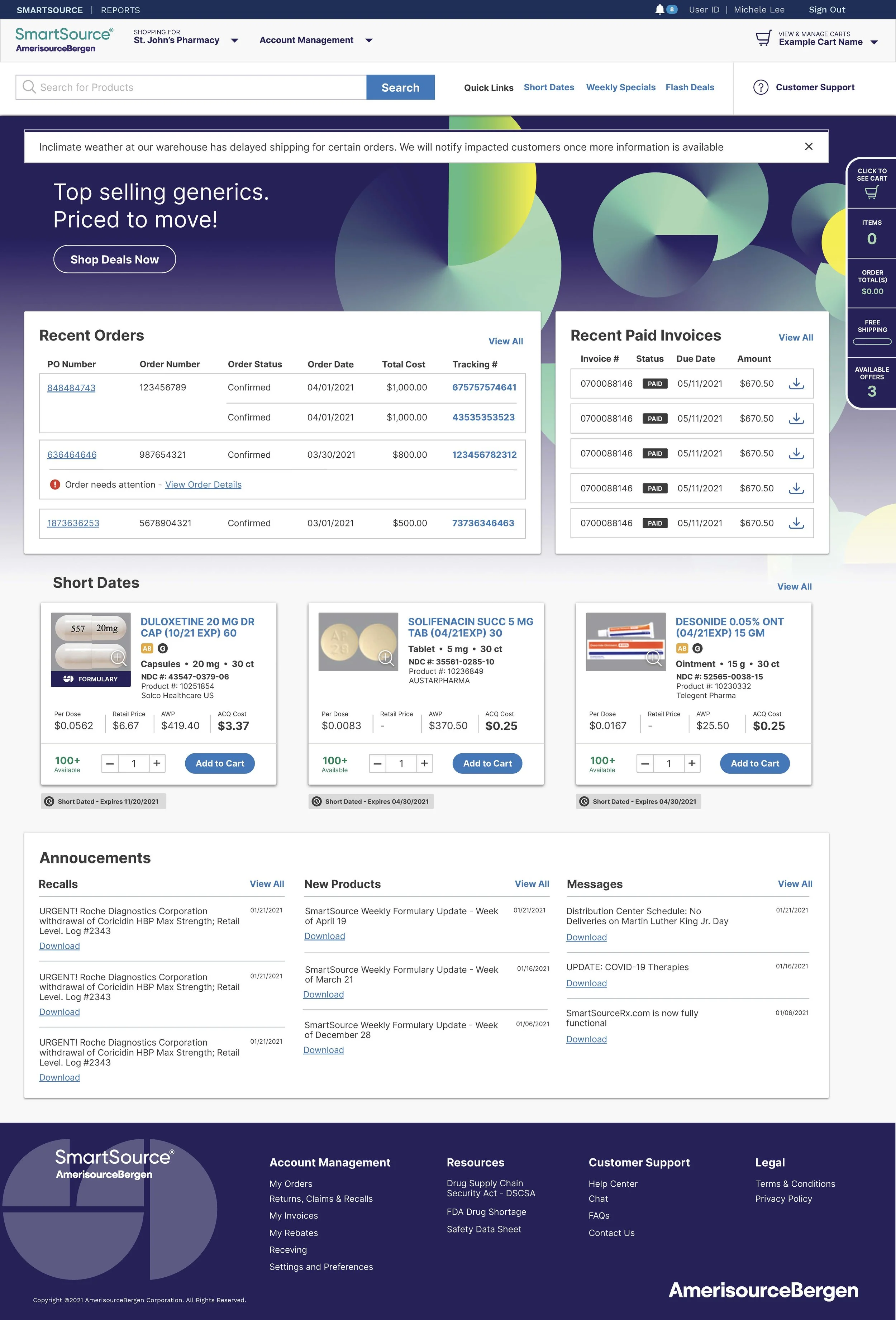
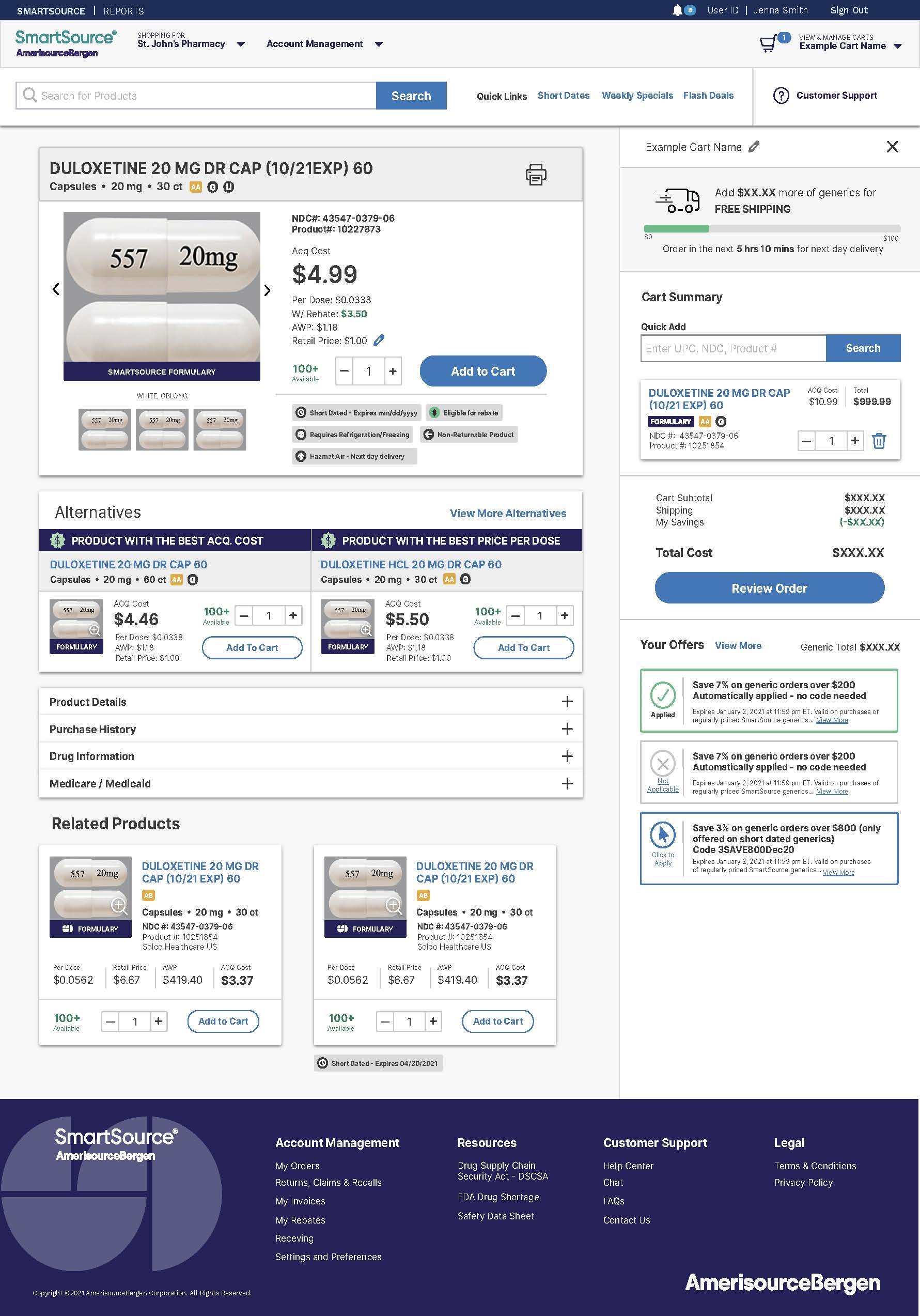
With the foundation set, I used the research to redesign the core of the shopping path: the home page, product listing, product detail, and checkout. The throughline was respecting the customer's time. A persistent cart that didn't vanish mid-session, frequently ordered products surfaced up front, recent invoices and back-in-stock items one tap away, and a checkout that got out of the customer's way.
One of the more interesting problems was helping customers when a product was out of stock at their local distribution center. Instead of letting them bounce to a competitor, we designed a flow that surfaced an alternative the storefront could fulfill, either inline while they shopped or as a check after they placed their main order. It gave customers a way to get what they needed without leaving, and it became one of the better received parts of the work. Satisfaction with that out-of-stock experience landed at 86%.
A lot of this work was navigating competing feedback. The brand team and the product team didn't always see things the same way, and I spent real energy finding solutions both sides could get behind.
Conclusion
This project taught me a lot about holding your ground in a room full of competing opinions. Product, IT, and brand all had strong views, and getting everyone to a place where they felt heard without letting the experience suffer for it was genuinely hard work. It's the kind of thing you can't really learn in a vacuum.
The Sketch to Figma migration threw me into the deep end in the best way. I rebuilt the entire design system in a tool I was still learning, and I came out much more confident in my ability to ramp up fast when a project demands it.
The part I'm most proud of is that the work stuck. The design system was adopted across the broader team and lived on after I rolled off, and customer satisfaction climbed steadily over the life of the project, from 68% up into the mid 80s. When you're in the middle of a messy, shifting project it can be hard to see the finish line, and this one was a good reminder that the messiest work sometimes produces the most durable results.
FROM THE CLIENT
“I love you guys. You guys have just killed it at every level, I've constantly been impressed. I usually feel like I have to provide a lot of oversight, but I happily felt like I was sitting in the backseat… you stand out in a large field of vendors by standing out as a reliable resource"